
When I first started in the eyelash manufacturing industry, I spent most of my time obsessing over the “D” curl, the softness of PBT fibers, and the weight of mink fur. I thought that if the lash was perfect, the business would follow. But after years of working with thousands of brand owners at Heyme Beauty, I’ve realized a hard truth: a world-class lash in a generic box is just a commodity. A world-class lash in a masterfully designed branded box? That is an empire.
Your logo is more than just a pretty icon on a piece of cardboard. It is the bridge between a factory in China and a customer’s vanity in New York, London, or Dubai. As a manufacturer, I see the “behind the scenes” of brand failures and successes every single day. I’ve seen beautiful designs that were impossible to print, and I’ve seen simple logos that turned small startups into multi-million dollar powerhouses.
In this guide, I want to walk you through the process of designing a lash logo from a perspective you won’t get from a graphic designer: the perspective of the person who actually has to build it.
Why the “Manufacturer’s Lens” Matters in Design
Most designers live in a digital world of infinite pixels and RGB backlighting. They create logos with ultra-thin gradients, microscopic lines, and neon colors. Then, those designs land on my desk at Heyme Beauty, and I have to be the one to tell the client, “We can’t stamp this in gold foil.”
When we talk about lash branding, we are talking about physical constraints. We are working with cardboard, acrylic, hot-stamping foils, and silk-screen inks. A logo that doesn’t account for these materials isn’t a brand identity—it’s just a drawing. To build a successful private label, you need to design with the “end in mind.” That means understanding how your logo interacts with different lash categories and packaging textures.
Branding by Category: One Size Does Not Fit All
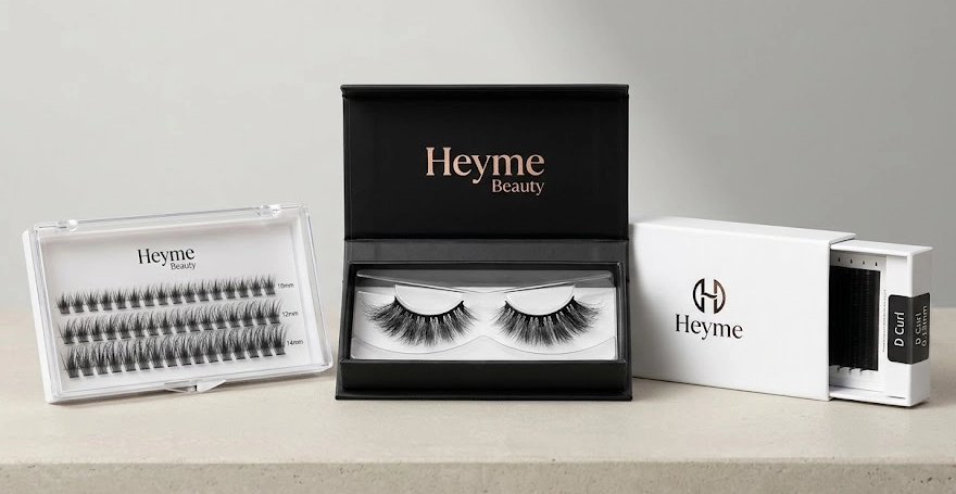
One of the biggest mistakes I see new entrepreneurs make is using the exact same logo execution for every type of lash they sell. At Heyme Beauty, we categorize production into four main pillars, and each one requires a specific branding logic.
The Retail Powerhouse: Strip Lashes
Strip lashes are the high-fashion side of the business. Because the packaging for strip lashes is usually larger—think magnetic boxes or sliding drawers—you have a “canvas.” For this category, your logo needs to be the hero. We often recommend centered, bold logos. Since strip lashes are often a “luxury” purchase, this is where you use the heavy hitters: embossing, debossing, and premium gold foiling. Your logo here says, “I am a professional-grade beauty accessory.”
The Modern Essential: DIY Lash Clusters
DIY clusters have exploded in popularity over the last two years. Unlike strip lashes, these are often sold in larger, transparent “map” boxes or acrylic cases. The consumer wants to see the 10D, 20D, and 30D clusters clearly. If you put a massive, solid logo in the middle of the lid, you’re blocking the product. For Heyme Beauty clients, we suggest high-contrast, minimalist logos placed in the upper third of the box. The branding should feel “efficient” and “modern,” matching the DIY, time-saving nature of the product.
The Tech-Kit: Magnetic Lashes
Magnetic lashes are functional. They come with an applicator and a magnetic liner. Your logo design needs to be “kit-ready.” This means your logo must be versatile enough to be shrunk down and silk-screened onto a round eyeliner tube without losing legibility. If your logo is too busy, it becomes a smudge on the liner bottle. We aim for sleek, sans-serif typography here that communicates “innovation.”
The Professional’s Choice: Eyelash Extensions
If you are selling to lash technicians and salons, your logo serves a different purpose. It’s a badge of quality. Professional trays are stacked in drawers by the hundreds. The logo should be clean and positioned so it doesn’t distract from the technical specs—the curl, length, and diameter. Salon branding is about “clinical” or “studio” vibes. Think of it as a laboratory label; it needs to look expert, not “cutesy.”
Avoiding the “Digital Trap”: Technical Pitfalls to Skip
Let’s talk about the technical side of the production line. When my team at Heyme Beauty prepares a client’s design for the printing plates, we look for “production killers.”
The first is Line Weight. In the world of gold or silver hot-stamping (the most popular choice for lash brands), we use a heated metal plate to press foil into the paper. If your logo has lines thinner than 0.2mm, the foil may not adhere properly, or it might “bleed” and blur. A logo that looks elegant on an iPhone screen can look like a mistake on a box if the lines are too delicate.
The second is The CMYK Reality Check. Your computer screen creates color by mixing light (RGB). We create color by mixing ink (CMYK). There are certain “electric” blues and “neon” pinks that simply do not exist in the world of physical ink. If your brand depends on a color that can’t be printed consistently, your second batch of products won’t match your first. At Heyme Beauty, we always advocate for Pantone matching to ensure your brand’s “Pink” is the same in 2026 as it was in 2024.
Elevating the Logo with Physical Craft
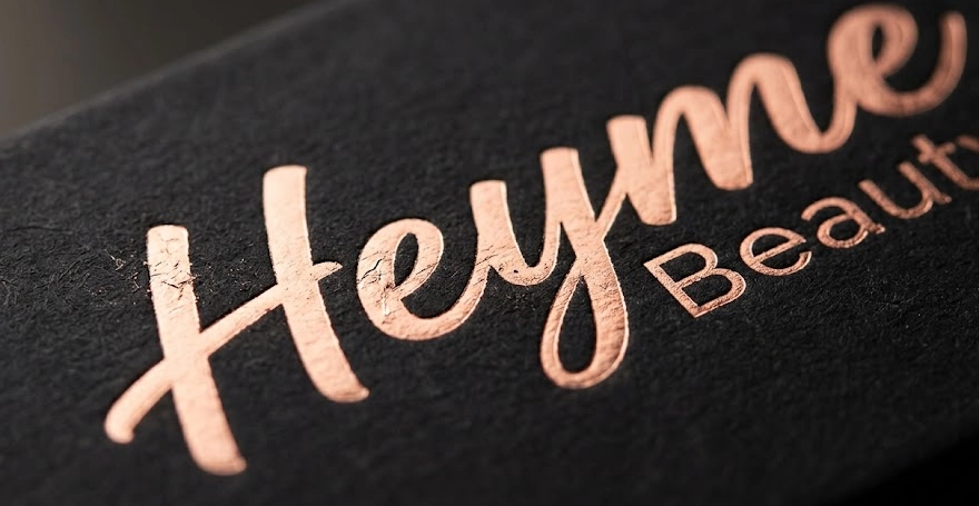
A logo is a 2D concept, but a lash box is a 3D experience. This is where you can out-compete the “big brands” by using finishes that feel expensive.
I am a huge advocate for Spot UV. Imagine a matte black box where your logo is printed in a clear, high-gloss “wet” look. It’s subtle, it’s sophisticated, and it screams high-end. Or consider Embossing. When a customer runs their thumb over your box and feels the raised texture of your logo, a psychological switch flips. They no longer feel they are holding a $\$5$ item; they feel they are holding a luxury investment.
The Heyme Beauty Philosophy: We Don’t Just Ship, We Incubate
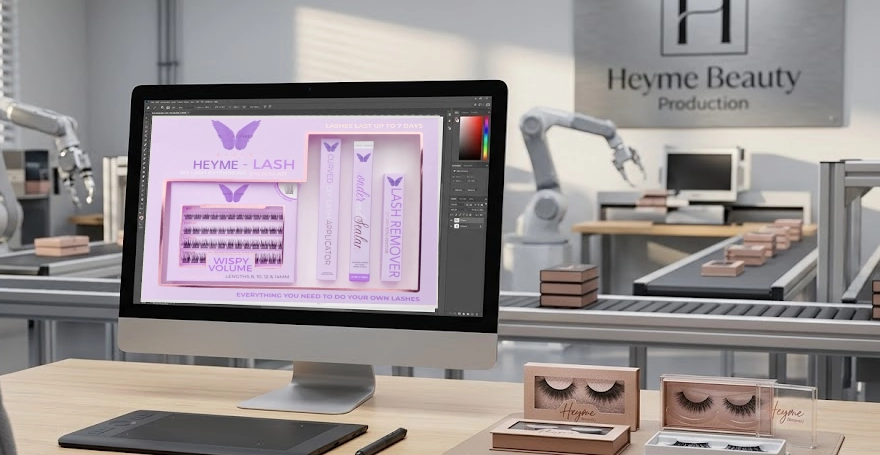
Why am I sharing all of this? Because at Heyme Beauty, we aren’t just looking for a one-time order. We want to be the factory that helped you build your empire. When a client comes to us with a rough idea, my design team doesn’t just “copy and paste.” We provide Technical Mockups. We show you how that logo will look under the lights of a retail store. We suggest tweaks to the font to make it “print-hardy.”
We provide an end-to-end “Brand Incubation” service. We know the 2026 trends—like the shift toward sustainable “raw” textures mixed with high-shine logos. We know that “Green Beauty” is no longer a niche, and your logo design should reflect that if you’re using our eco-friendly lash fibers.
Frequently Asked Questions (FAQ)
Q: Do I need a different logo for my lash trays and my outer shipping boxes?
A: Not necessarily a different logo, but a different version. We recommend a “Main Logo” for your primary packaging and a “Simplified Icon” or “Wordmark” for smaller spaces like lash trays or the side of a box. Consistency is key, but adaptability is a must.
Q: Can Heyme Beauty help me if I don’t have a logo yet?
A: Absolutely. While we are primarily a manufacturer, we have an in-house team that specializes in lash brand identity. We can take your “vibe board” and turn it into a production-ready logo that we know will print beautifully on our boxes.
Q: What is the most durable printing method for a logo?
A: For acrylic or plastic cases (like DIY clusters), silk-screen printing is incredibly durable. For paper boxes, hot-foil stamping is the gold standard for durability and “wow” factor. It doesn’t fade or peel like some cheap stickers might.
Q: Should I use my face or a person’s silhouette in my lash logo?
A: This is a trend that was huge in the 2010s, but we are moving toward “Modern Minimalism.” Silhouettes can be hard to print clearly in small sizes. I usually suggest a strong, unique typeface for the brand name “Heyme Beauty” style, which ages much better as your brand grows.
Q: Does the color of my logo affect the cost of manufacturing?
A: Yes, it can. A single-color foil stamp is very cost-effective. If you have a logo with five different colors that need to be aligned perfectly, it requires more “passes” through the machine, which increases the price. Simple, bold designs are usually the most budget-friendly and the most impactful.
Conclusion: Your Vision, Our Hands
Designing a lash logo is the first step in a very exciting journey. It is the moment your dream gets a name and a face. But remember, a logo doesn’t live in a vacuum; it lives on a box, in a bag, and in a customer’s hands.
Don’t settle for a design that only looks good on a screen. Work with a partner who understands the grain of the paper, the heat of the foil, and the curvature of the lash tray. At Heyme Beauty, we take pride in being the hands that bring your vision to life. Whether you are launching a DIY cluster line for Gen-Z or a professional extension line for luxury salons, your logo is the promise you make to your customers. Let’s make sure it’s a promise you can keep.
If you are ready to see your logo on the world’s finest lashes, let’s talk. The production line is ready.